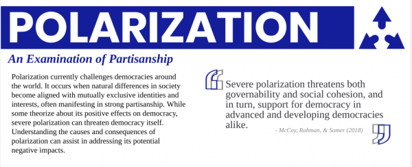
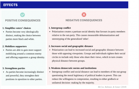
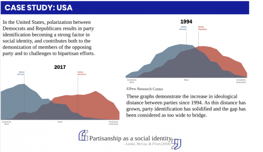
Polarization is a widespread phenomenon, with profound effects on the state of democracy around the world. This infographic was intended to serve as a starting point for individuals to acquaint themselves with polarization, examining positive and negative consequences, major trends, presenting a case study of the USA, and providing readers with further resources on the topic. Often polarization is presented solely as a negative phenomenon, increasing intergroup conflict and weakening democratic norms and institutions. However, it also involves positive effects, including simplifying voter choices and mobilizing supporters. I wanted to present readers with an unbiased report on polarization, introducing them to the topic. Polarization is a pivotal topic in politics, and understanding its effects on politics and democracy is important for any citizen who wishes to be informed on the forces at play in politics today.
This project was researched using a myriad of sources, including both scholarly and peer-reviewed articles and less formal news articles, movies, and podcasts. Using this array of resources allowed me to create an infographic that amalgamated the wide-ranging discourse surrounding this topic. My goal was to use resources that were accessible to all audiences, not only academics. In creating this project, I was able to refine my own research abilities, as I sought out resources of different mediums and from different perspectives.
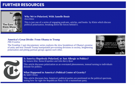
Through designing this project, I was tasked with creating an infographic that was both informative and visually appealing. It was important to me that the infographic was easy to follow and would not only catch the attention of readers, but be organized in an engaging manner. Ultimately, I utilized a main theme colour, as well as images, colour coding, and stylized fonts to aid in its readability and provide visual learning cues to the reader that bolstered the main points.
If you would like to view this infographic in its entirety, it can be viewed at this link: Polarization Infographic.

This project strengthened my understanding of polarization, and allowed me to develop my critical analysis, graphic design, and writing skills. I have often struggled with being concise in my writing, yet the format of this project demanded it, as I had limited space and did not want to overwhelm my infographic with long blocks of texts.